


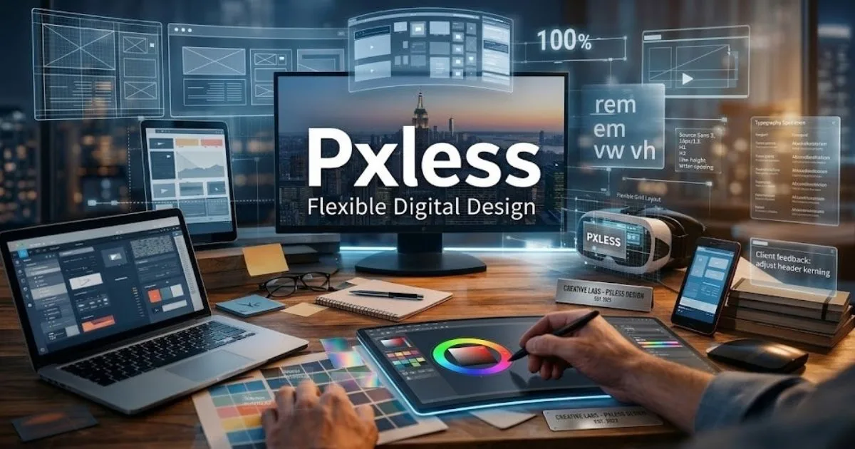
Pxless is a modern digital design philosophy that moves away from fixed pixel values and uses scalable units like rem, em, vw, and percentages instead. As devices multiply from foldable phones to AR headsets, rigid pixel-based layouts break, load slowly, and fail accessibility standards.
Pxless solves all three problems by building interfaces that adapt naturally to any screen, respect user preferences, and perform better on Google’s Core Web Vitals. In 2026, understanding pxless is no longer optional for designers, developers, and digital product teams.
What Does Pxless Mean?
The word pxless combines “px” (the CSS shorthand for pixel) and “less.” It does not mean pixels disappear from screens entirely. Screens still display pixels. What changes is how designers and developers communicate measurements inside their code and design files.
Traditional pixel-based design says: “This button is exactly 200px wide.” Pxless design says: “This button takes 30% of its container.” That one shift cascades into better layouts, faster code, and a better experience on every device.
Pxless is not a tool, plugin, or framework. It is a design thinking approach that changes the units, systems, and relationships you choose when building any digital product.
Why Pixel-Based Design Is Failing in 2026
In the early 2000s, most people browsed on similar desktop monitors. Designing with fixed pixel values made perfect sense back then. A 1200px-wide layout looked consistent everywhere.
Today that world is gone. The same website gets opened on a 320px budget phone, a 1440px laptop, a 4K monitor, a foldable screen, and even a smartwatch. A pixel-perfect layout for one screen becomes broken on another.
Here is what goes wrong with fixed pixels:
- Zoom failures : Fixed font sizes ignore browser zoom and user accessibility settings
- Fragile breakpoints : Designers end up writing hundreds of CSS override lines for different screens
- Slow performance : Over-specified pixel values bloat stylesheets and slow page rendering
- Localization problems : German or Arabic text is longer than English; fixed containers clip translated content
- New device categories : AR headsets, car displays, and IoT screens have no “standard” pixel size at all
Core Principles of Pxless Design
1. Relative Units Over Absolute Units
Instead of font-size: 16px, a pxless stylesheet writes font-size: 1rem. The rem unit scales relative to the browser’s root font size. If a user sets their browser default to 20px, every rem-based element scales proportionally. Nothing breaks.
| Unit | Scales Against | Best Used For |
| rem | Root font size (browser default) | Typography, spacing |
| em | Parent element font size | Component-level spacing |
| % | Parent container dimensions | Fluid layouts, images |
| vw / vh | Viewport width / height | Full-screen sections, hero text |
| clamp() | Min, preferred, max values | Fluid typography ranges |
| fr | Available grid space fraction | CSS Grid columns |
2. Fluid Grids and Flexible Layouts
Pxless layouts use CSS Grid and Flexbox with fractional units and percentages. Columns expand and contract as the viewport changes. There are no fixed 960px or 1200px containers forcing content into rigid boxes.
A pxless grid might read: grid-template-columns: repeat(auto-fit, minmax(280px, 1fr)). That one line creates a fully responsive layout from a 320px phone to a 4K screen with zero extra media queries.
3. Fluid Typography with clamp()
CSS clamp() sets a minimum size, a preferred fluid size, and a maximum size for any text. A headline might be set as clamp(1.5rem, 4vw, 3rem). On a small phone it reads at 1.5rem. On a large monitor it maxes at 3rem. Everywhere between, it scales smoothly.
4. SVG for Icons and Logos
Pxless design replaces fixed-size raster icons (PNG, JPG) with SVG. An SVG icon renders perfectly at any size because it is a mathematical shape, not a grid of pixels. Brand logos stay sharp on Retina and high-DPI screens without managing multiple image files.
5. Design Tokens and Shared Systems
Design tokens are named variables for spacing, color, typography, and motion. Tools like Figma Tokens, Style Dictionary, and Theo let teams define one source of truth. Change one token and every component updates. This is pxless thinking applied at the system level.
Read also: Sosoactive Explained: What It Is, How It Works, and Why It Matters
Pxless vs Traditional Pixel Design
| Factor | Pixel-Based Design | Pxless Design |
| Unit of measurement | Fixed px values | rem, em, %, vw, clamp() |
| New device support | Requires manual overrides | Adapts automatically |
| Browser zoom (accessibility) | Often breaks layout | Scales proportionally |
| Codebase size | Large, many breakpoints | Leaner, fewer overrides |
| Team collaboration | Pixel handoff specs | Shared design tokens |
| CSS performance | Higher (more rules) | Lower (systematic) |
| Future-proofing | Brittle to new form factors | Resilient by design |
| SEO and Core Web Vitals | Higher risk of poor scores | Faster and mobile-friendly |
Real-World Examples of Pxless in Action
Google Material You
Google’s design system uses dynamic color, fluid grid spacing, and scalable type roles that adapt to device size and user preferences. The entire system is token-driven and avoids hard pixel values at the system level. That is pxless thinking at enterprise scale.
Apple Human Interface Guidelines
Apple specifies spacing and typography in “points” rather than pixels, with built-in Dynamic Type support that scales text based on user accessibility settings. SwiftUI layouts use proportional stacks and spacers rather than fixed dimensions.
Tailwind CSS v3+
Tailwind ships with a default spacing scale based on rem units and fluid layout classes. Its JIT compiler makes it easy to build entirely pxless component libraries without touching a single absolute pixel value.
Benefits of Pxless Design
What you gain:
- Works consistently on every device without manual overrides
- Respects browser zoom and user-defined font settings
- Leaner CSS files and faster page load times
- Better Google Core Web Vitals scores (CLS, LCP)
- Easier content localization across multiple languages
- One design system that works across all platforms
- Future-ready for AR, VR, foldables, and unknown screen sizes
- Stronger accessibility compliance with WCAG standards
What to watch out for:
- Learning curve for designers trained on pixel-perfect workflows
- Harder to match exact brand specs without proper token setup
- Needs comprehensive testing across more screen conditions
- Older browsers handle some newer units inconsistently
- Requires upfront planning and team alignment on token conventions
How Pxless Improves SEO and Performance
Google’s ranking algorithm directly rewards fast, mobile-friendly, accessible pages. Pxless contributes to all three signals at once.
- Fewer CSS bytes : Relative units reduce breakpoint overrides, shrinking stylesheet size
- Lower Cumulative Layout Shift (CLS) : Fluid containers that scale proportionally stop unexpected layout jumps
- Mobile-first by default : Pxless systems start flexible and expand, rather than shrinking a desktop layout down
- Faster rendering : Fewer redundant CSS rules mean quicker paint times and better LCP scores
- Accessibility signals : Pages that respect user zoom and font settings score better on accessibility audits, which Google factors in
Research from multiple 2026 sources confirms that pxless designs consistently outperform pixel-based sites on Core Web Vitals benchmarks, especially on mid-range mobile devices.
Pxless and Accessibility: A Direct Connection
Fixed pixel sizes create real barriers for people with visual impairments. When a user increases their default browser font size, a pixel-based layout often stays the same or breaks entirely. A pxless layout scales with the user’s preference.
This matters for three reasons:
- WCAG compliance : Web Content Accessibility Guidelines recommend relative units for text and spacing
- Larger audience reach : Over 2.2 billion people globally have some form of vision impairment
- Legal risk reduction : Accessibility lawsuits against websites have grown significantly since 2020
Pxless does not automatically make a website fully accessible. But it removes one of the biggest structural barriers to accessibility from the start.
Pxless in 2026: Spatial Computing and AI Layouts
The relevance of pxless has grown significantly in 2026 because of two new trends.
Spatial computing and AR/VR interfaces have no concept of a fixed pixel grid. Apple Vision Pro, Meta Quest 3, and competing headsets render interfaces inside physical space. Pxless principles translate directly into these environments because they are built on relationships and proportions, not rigid sizes.
AI-powered dynamic layouts are another frontier. Generative AI tools can now analyze content semantics and suggest optimal layout behavior across contexts. These AI systems work far better when the underlying design uses relative units rather than hardcoded pixels, since they can calculate proportions without needing device-specific overrides.
How to Start Implementing Pxless Design
You do not need to rewrite your entire codebase. Start small:
- Audit your current CSS : Find where fixed px values are used for font-size, padding, and width
- Convert typography first : Switch font sizes from px to rem; this alone solves most zoom accessibility issues
- Use clamp() for headings : Replace your H1 and H2 sizes with fluid clamp() ranges
- Replace fixed containers : Change width: 1200px to max-width: 75rem with percentage padding
- Switch icons to SVG : Export your icon set as SVG and retire your PNG sprite sheets
- Set up a spacing scale : Define 5 to 8 spacing tokens in rem and use them consistently across components
Final Thoughts
Pxless is one of those ideas that sounds technical but solves a deeply human problem: people use the internet on wildly different devices, and their experience should not suffer because a designer hard-coded a button at 200 pixels wide.
In 2026, with foldable screens, AR interfaces, and AI-generated layouts becoming mainstream, the ability to design systems that adapt rather than break is a real competitive advantage. Teams that adopt pxless principles today spend less time debugging layout issues and more time building features that actually matter.
Pixel-perfect was never a real standard. It was an illusion that worked only when everyone used the same screen. Pxless replaces that illusion with something better: design that works everywhere, for everyone, on every device that exists today and every device that has not been invented yet.
Frequently Asked Questions
What does pxless mean in digital design?
Pxless refers to a design approach that reduces dependence on fixed pixel measurements and uses scalable, relative units like rem, em, vw, and percentages to build flexible digital interfaces.
Is pxless the same as responsive design?
Not exactly. Responsive design adjusts layouts at specific breakpoints. Pxless goes deeper by building flexibility into the measurement system itself, so layouts scale continuously rather than jumping between fixed states.
Does pxless mean no pixels are used at all?
No. Screens still display everything in pixels at the hardware level. Pxless means your code uses relative units instead of fixed pixel values, so the browser handles scaling automatically.
Why is pxless important for SEO in 2026?
Google rewards mobile-friendly, fast-loading, accessible pages. Pxless designs are lighter, scale better on mobile, and respect user settings, which directly improves Core Web Vitals scores.
Can pxless improve accessibility?
Yes. Because pxless allows elements to scale when users increase their browser font size or zoom level, it supports people with visual impairments far better than fixed pixel layouts.
Is pxless difficult to learn?
It requires a mindset shift for designers used to pixel-perfect workflows. However, modern tools like Figma, Tailwind CSS, and CSS Grid make the transition straightforward once you understand the core units.
Will pxless replace pixel-based design completely?
Pixels will not disappear. But pxless principles are rapidly becoming the standard approach, much like responsive design replaced fixed-width layouts over the past decade.
Read also: Riverbank Collapse Iford Playing Fields: Causes, Impact and What Happens Next